Examining Yield Curve Similarity (Part 1)
Where Do We Sit Today?
The level of and change in the Yield Curve affects the economy and return streams across the different asset classes. It's a reasonable thing to wonder if historical data can be used to decipher what will transpire in the future.
In order to conduct a study of that sort it would be helpful to have a metric that says "these past environments are similar to today's". When we speak of yield curves we typically think of where it sits in yield space as well as it's shape.
So where does today's yield curve sit and what shape does it have. The following chart shows the yield curve as of September 5th 2023.
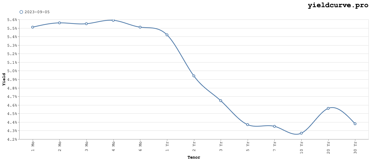
The average yield sits somewhere just below 5% and the shape is "inverted". From the 4-month to the 10-year tenor, rates decrease monotonically with an odd local maxima (hump) at the 20-year point. While the level, historically speaking, isn't that unusual the shape is.
Metrics
One way to define similarity is to use a distance metric. One could use a function of correlation
$$d(\rho) = \sqrt{2(1 - \rho)}$$
A naive approach, and the one we'll adopt, is to use the mean average deviation (or normalized Manhattan Distance) between yield curves at two distinct dates
$$ d(\tau, t) = \frac{1}{N}\sum_{i=1}^{N}|y_{i}(\tau) - y_{i}(t)|$$
Notice that this distance is expressed in units of yield. Holding one date fixed (at say, September 5 2023) and letting the other range over all available data results in the following chart.
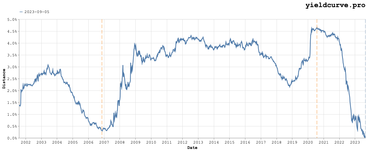
Obviously, the distance between the fixed yield curve and itself will be zero. So, if we want to identify meaningfully similar yield curves (i.e., smaller distances) at different points in time we need to begin looking a certain number of days away from the fixed date. In this case, we've arbitrarily chosen two quarters on either side. The vertical dashed line in blue denotes the fixed date and the two orange lines denote the dates with minimum and maximum distance.
The maximum distance occurs on July 31, 2020 with the corresponding yield curves shown in the following chart.
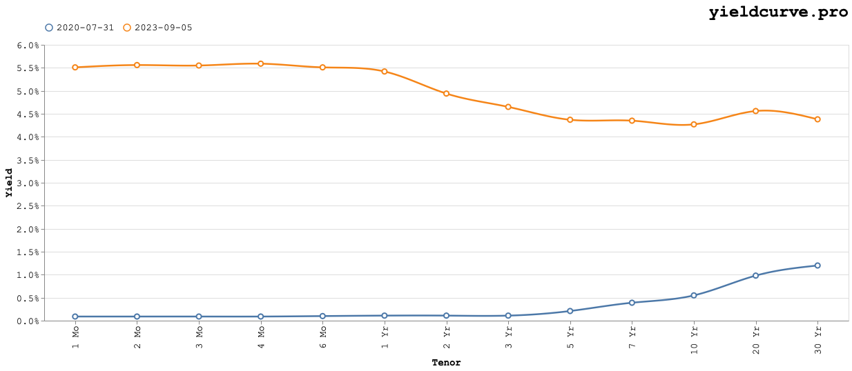
These curves are on opposite sides of the yield space (level) and have different shapes (slopes) as the older curve is upward sloping. In this instance it seems our chosen distance metric works.
The minimum distance occurs on November 14, 2006 with the corresponding yield curves shown in the following chart.
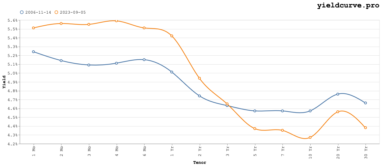
Again, the distance metric appears to work as intended. Both curves are centered around the same approximate level of 4.8%. Also, both curves are inverted with similar slopes.
Conclusions
What conclusions can we draw from this? Do the curves with minimum distance identify similar interest rate environments?
Unfortunately, similar level and slope are not enough. We have completely ignored path dependency. Namely, what trajectory did each curve travel to arrive at those configurations? And how would we go about measuring those? Perhaps we can use the notion of Bull, Bear, Flatteners, Steepeners?
We will leave that for a subsequenbt blog post.
Back