The Shape of Risk: Ten Treasury Curve Snapshots That Defined the Modern Era
The yield curve doesn't lie. It may delay. It compresses, distorts, and occasionally behaves as if it has completely lost the plot (March 2020). But it always records. Every rate decision, every crisis, every policy error leaves a mark in the spread between a 3-month bill and a 30-year bond.
What follows is a tour of ten moments: the exact curve snapshot on the day each entered the record books. Not the narrative recap published a month later — the actual yield vector, precise to the basis point.
September 17, 2001 — First Trading Day After 9/11
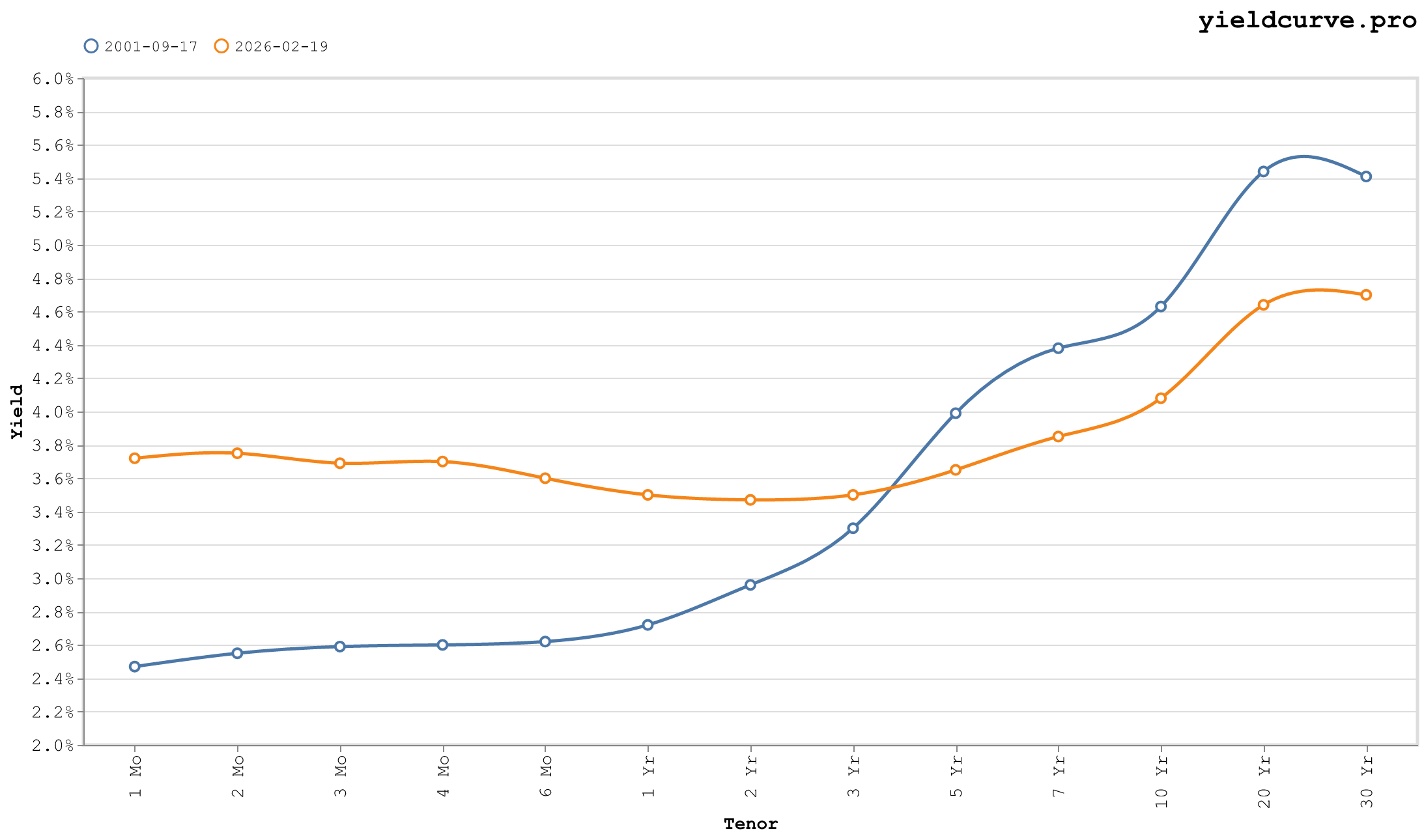
Figure 1: Post-9/11 — 10Y at 4.63%, 2s10s +167 bps, 30Y at 5.41%.
Treasury yields on Monday, September 17 captured a market reopening under circumstances no model had priced. The 10Y closed at 4.63%, down roughly 40 bps from the prior week, as investors fled to duration. The 2Y sat at 2.96%, producing a 2s10s of +167 bps. The 30Y at 5.41% — 78 bps above the 10Y — reflected genuine uncertainty about the long-run outlook, not technical distortion.
The curve was steep, normally shaped, and telling a specific story. The front end had already absorbed Fed easing expectations (the FOMC cut 50 bps the day markets reopened, part of 475 bps of cumulative cuts begun in January 2001). The long end stayed elevated because the inflation regime hadn't been challenged yet — real rates were still positive, and duration demand was flight-to-quality, not yield-seeking.
Institutional positioning was defensive: duration extended, credit avoided. The 10Y-3Mo spread at +204 bps offered substantial carry to anyone willing to hold through the volatility.
Signal at the time: Recession — already underway; the NBER had dated it from March 2001. The Fed would cut to 1% over the next two years, building the steepest curve in a generation.
June 25, 2003 — Fed Funds at 1%
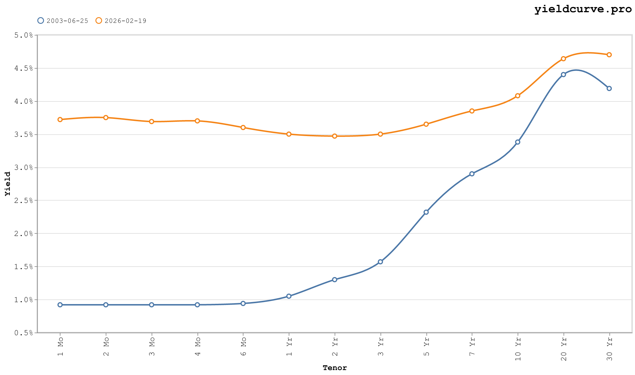
Figure 2: Fed Funds 1% — 10Y at 3.38%, 2s10s +208 bps.
The post-dot-com easing cycle reached its terminal point. The FOMC cut to 1% on this date — the lowest policy rate since 1958 — completing 550 bps of total cuts from the 6.5% peak in January 2000.
The curve was historically steep. The 10Y printed 3.38%, the 2Y 1.30%, producing a 2s10s of +208 bps. The 10Y-3Mo spread: +246 bps. The 30Y at 4.19% sat 81 bps above the 10Y. Every segment sloped upward. For duration investors, this was peak carry territory: the 5Y at 2.32% offered approximately 40 bps per year of rolldown as bonds aged toward the 2Y.
The Level/Slope/Twist decomposition (Litterman-Scheinkman 1991) showed an unusually clean picture: the Twist — the third factor measuring curve convexity — was near-neutral, reflecting a parallel shift downward from the prior cycle rather than reshaping. The 30Y-10Y at +81 bps was the wide end of its historical range, signaling that long-end buyers remained skeptical about the sustainability of sub-1% policy.
Signal at the time: Reflation. Growth and inflation recovered faster than the market expected. The 10Y reached 5.22% by June 2006.
June 29, 2006 — The Terminal Rate
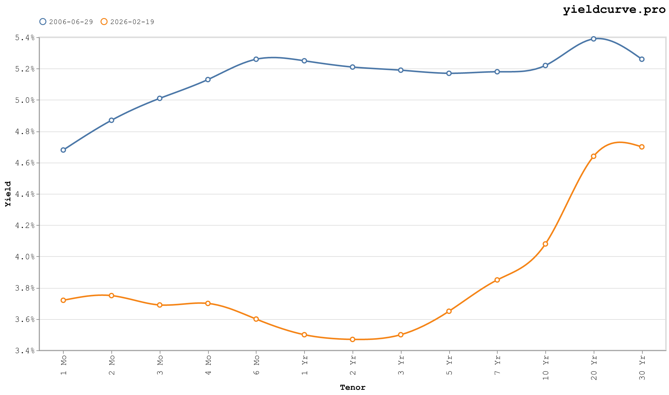
Figure 3: Tightening Peak — entire 2Y–30Y within 8 bps, 2s10s +1 bp.
The Fed delivered its seventeenth consecutive 25-bps hike, pushing fed funds to 5.25%. On this date the 2Y closed at 5.21%, the 10Y at 5.22%, and the 30Y at 5.26%. The 2s10s was +1 bp.
The level compression is the story. The entire 2Y–30Y segment traded within an 8-bps range: from 5.17% (5Y) to 5.26% (30Y). A butterfly through 5Y would have printed near-zero. The 10Y-3Mo spread, at +21 bps, was in yellow-flag territory. Late-cycle flat curves are not accidents — the market was pricing in: (1) the Fed at or near done, (2) a growth slowdown developing, and (3) insufficient inflation pressure to force the long end higher.
All three were correct. The recession began in December 2007. The inversion began within weeks of this snapshot.
What the curve did not know: the mortgage credit bubble was already embedded in structured products, and the unwind would be orders of magnitude more disorderly than the yield curve's tidy 21-bps warning suggested.
Signal at the time: Peak of the cycle. Duration extension was the correct trade — the 10Y would rally from 5.22% to 2.37% over the next 30 months.
September 15, 2008 — Lehman Declares Bankruptcy
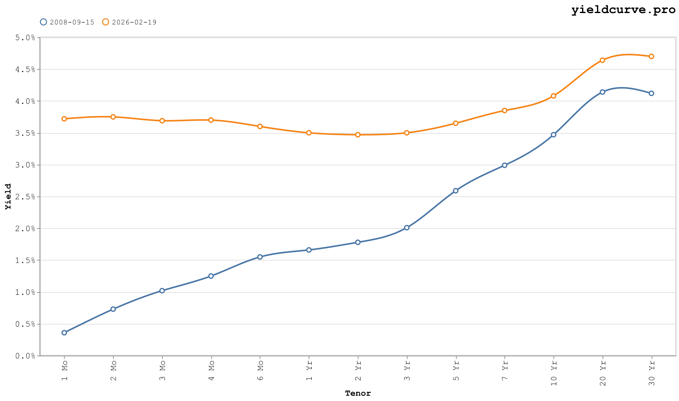
Figure 4: Lehman — front-end dislocation, 1Mo at 0.36%, 10Y at 3.47%.
The front end dislocated. The 1-month bill yielded 0.36% while the 10Y was 3.47% and the 30Y 4.12%. The 3-month at 1.02% sat 245 bps below the 10Y. In spread terms the curve looked steep — 2s10s +169 bps — but the shape masks the chaos.
The front end was not normalizing from inversion. It was in free-fall because counterparty risk had made short-term funding toxic. Reserve Primary Fund broke the buck within hours of market close. Commercial paper markets froze. Primary dealers could not fund inventory. The yield curve as a signal had already done its job: it inverted in 2006 and called the recession. What followed on September 15 was the implementation — the moment the credit system acknowledged what the curve had been pricing.
The 1-month at 0.36% against fed funds at 2.00% (the policy rate at the time) understates the panic: T-bills were being bought at a premium to their intrinsic risk-free value because counterparties were not trusted to survive the weekend.
Signal at the time: Acute systemic crisis. The Fed would cut to zero within three months.
December 16, 2008 — ZIRP Begins
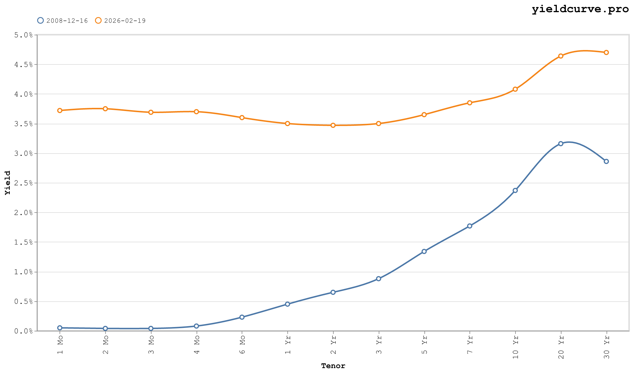
Figure 5: ZIRP — front end pinned at 0.04–0.65%, 10Y at 2.37%.
The FOMC set the target range to 0–0.25%. It would not leave it for seven years. The 1-month bill closed at 0.05%, the 3-month at 0.04%. The 2Y at 0.65% and the 10Y at 2.37% produced a 2s10s of +172 bps.
This curve established the template for the next decade. Policy rate anchored to zero, front end pinned, and a steeply sloped belly offering substantial carry for anyone willing to extend duration. The 10Y at 2.37% would prove generous — it would rally to 1.38% by mid-2016 as the recovery repeatedly disappointed. The Twist factor was positive: the 5Y at 1.34% was cheap relative to both the 2Y (0.65%) and the 10Y (2.37%), a classic ZIRP geometry.
The 30Y at 2.86% sat 49 bps above the 10Y — compressed relative to historical norms, reflecting early QE expectations. Within weeks, the Fed would announce purchases of \$600B in agency MBS and $100B in agency debt, extending that program repeatedly over the following years.
Signal at the time: An extended period of zero rates and unconventional policy. The correct trade — long duration — would work for most of the next thirteen years.
September 21, 2011 — Operation Twist
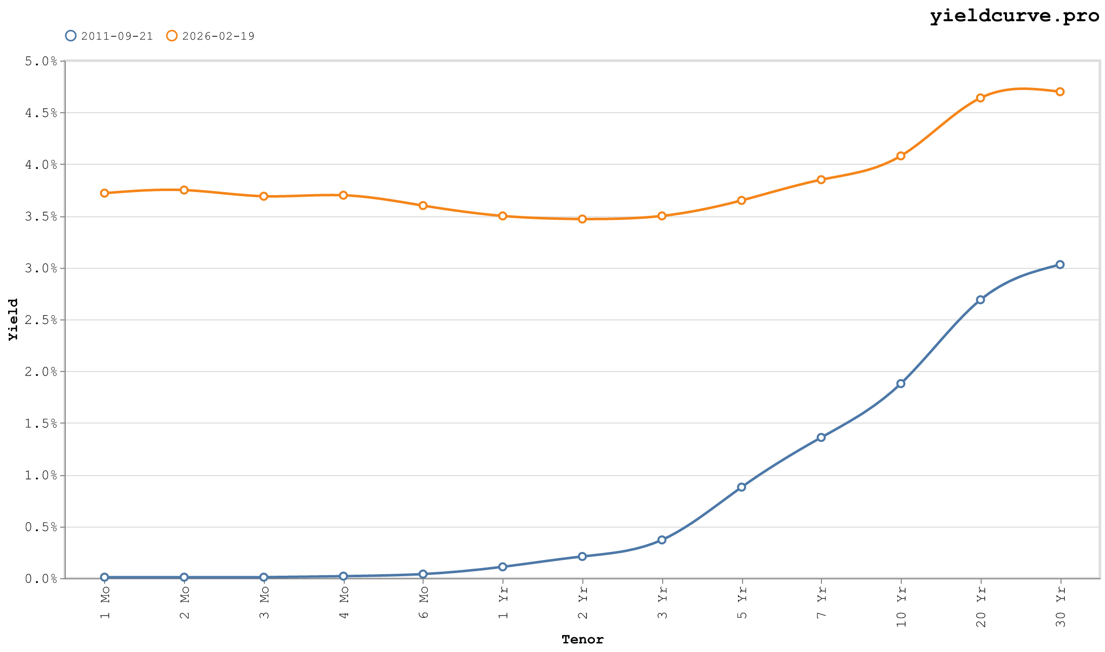
Figure 6: Operation Twist — 30Y-10Y at +115 bps, the Fed actively managing curve shape.
Three years of ZIRP had not produced escape velocity. Growth was running at roughly 2%, unemployment still above 9%, and the ECB was flirting with sovereign debt crisis. The FOMC announced Operation Twist: sell $400B of short-dated Treasuries, buy $400B of bonds with 6–30 year maturities. The mechanical goal was to flatten the long end without expanding the balance sheet.
On this date the front end was already at zero (1M: 0.01%, 3M: 0.01%). The 2Y at 0.21% had nowhere to go. The 10Y at 1.88% and the 30Y at 3.03% produced a 30Y-10Y of +115 bps — the widest long-end premium in this dataset, and exactly what Operation Twist was designed to compress.
It worked. The 10Y-2Y spread narrowed from +167 bps to roughly +130 bps over the following months as the Fed bid for duration. The level, however, fell further than intended: by mid-2012, the 10Y was below 1.50%.
Signal at the time: Structural slowdown. The Fed was now actively managing the shape of the curve, not just its level. That distinction matters for duration positioning: when the central bank becomes a price-insensitive buyer of long bonds, short the belly.
March 12, 2020 — Treasury Market Dysfunction
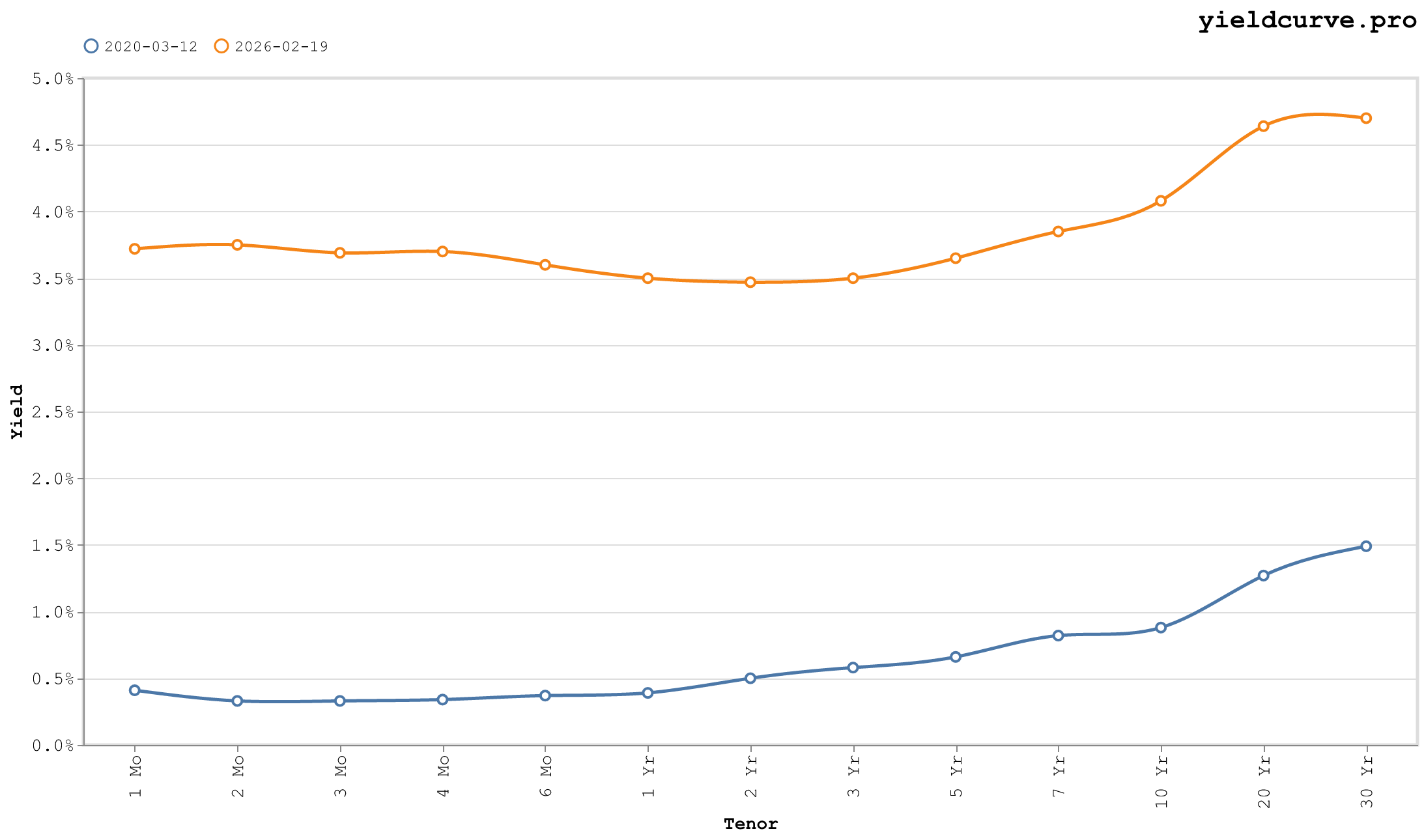
Figure 7: COVID Crash — near-flat at all-time lows, 10Y at 0.88%, 3Mo at 0.33%.
Every yield was in free-fall, and the Treasury market itself had broken. The 3-month at 0.33% and the 10Y at 0.88% produced a 10Y-3Mo of +55 bps — technically positive, but compressed by 100+ bps in a single week as cash flooded into front-end instruments.
The dysfunction was not in the yields but in the bid-ask spreads, fails, and repo market stress. Primary dealers could not warehouse inventory against a wall of selling from offshore central banks and leveraged risk-parity funds simultaneously liquidating. The Fed initiated emergency repo operations — up to $1.5T in overnight repos within 48 hours — and within days announced unlimited QE.
The curve printed nearly flat not because the market thought that was fair value, but because it was broken. The 2Y at 0.50% and the 30Y at 1.49% captured an extraordinary compression of term premium. Risk-free duration, the instrument of last resort, was being sold to meet margin calls.
Signal at the time: Liquidity crisis, not just credit crisis. The Fed's balance sheet would double in six weeks. Yields this low had one direction to go when normalcy returned.
March 16, 2022 — First Hike in Three Years
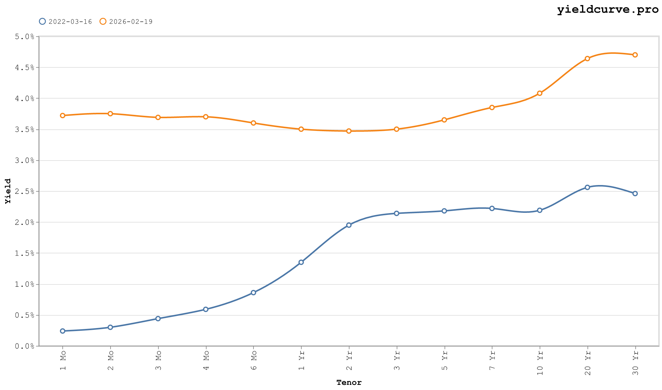
Figure 8: First Hike — 2Y at 1.95%, 2s10s +24 bps, inversion already priced into the belly.
The FOMC raised 25 bps on this date. The 2Y had already repriced aggressively: it closed at 1.95%, front-running several hundred basis points of additional tightening the market had priced into the next twelve months. The 10Y at 2.19% produced a 2s10s of +24 bps. The clock was running.
The entire 2022 curve tells a single story. The 1-month at 0.24% still reflected the world as it was (fed funds at 0.25%), while the 2Y at 1.95% reflected the world as the market expected it to become. That 171-bps gap between the bill and the 2Y note was the market's estimate of cumulative hikes in less than two years. It was approximately correct.
The 10Y-3Mo of +175 bps looked healthy. Until you realized the 3-month at 0.44% was 450+ bps below where the policy rate would trade in twelve months. Inversions are built from that gap closing — not from the long end rising, but from the front end catching up.
Signal at the time: Inversion within months. The 2s10s inverted in April 2022 and reached -109 bps by March 2023.
May 4, 2023 — Deepest Inversion in Decades
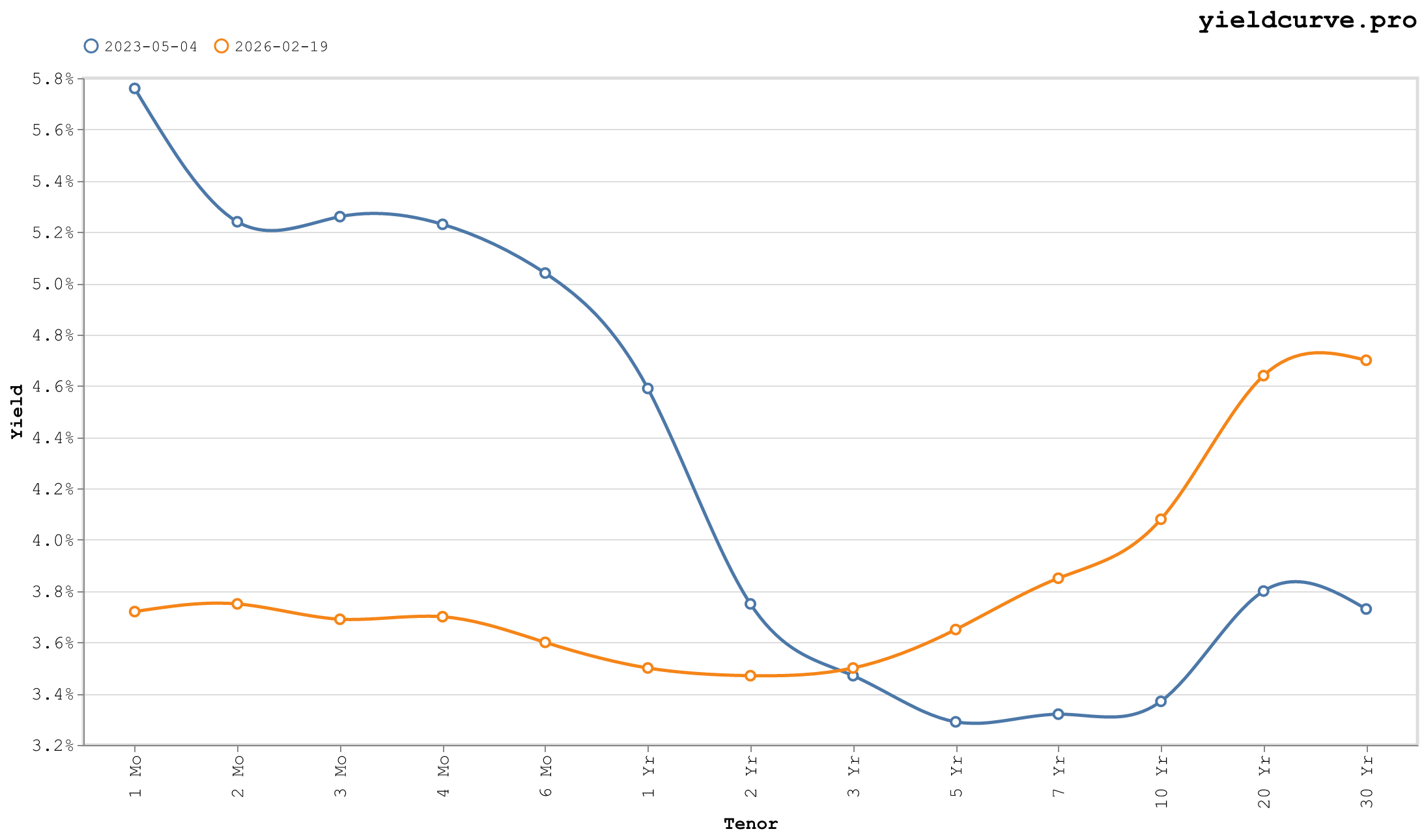
Figure 9: Deepest Inversion — 10Y-3Mo at −189 bps, most inverted in over forty years.
The 3-month bill yielded 5.26%. The 10Y yielded 3.37%. The 10Y-3Mo spread: -189 bps. The most inverted in over forty years.
The 2Y at 3.75% itself sat 151 bps below the 3-month — the front end had inverted on its own. This is not a normal monetary policy inversion; this is a full-spectrum repricing where even the short belly trades below bills. The Level factor (10Y) had detached from the Slope factor (front-end policy rate) by the widest margin since Volcker.
Money market funds absorbed over $700B of net inflows during this tightening cycle. Institutional duration extension had stopped. The Barclays Aggregate had returned -13% in 2022 — its worst year since inception — and no portfolio manager was eager to extend.
The 2Y at 3.75% was simultaneously pricing in: (1) the hiking cycle was done or nearly done, and (2) the Fed would cut rapidly to neutral within 18 months. Both assumptions proved wrong. The Fed was not done, and cuts came slowly.
Signal at the time: Maximum pessimism on duration — which, historically, is when duration works best. The 2s10s has since recrossed positive.
October 19, 2023 — The 10Y Touches 5%
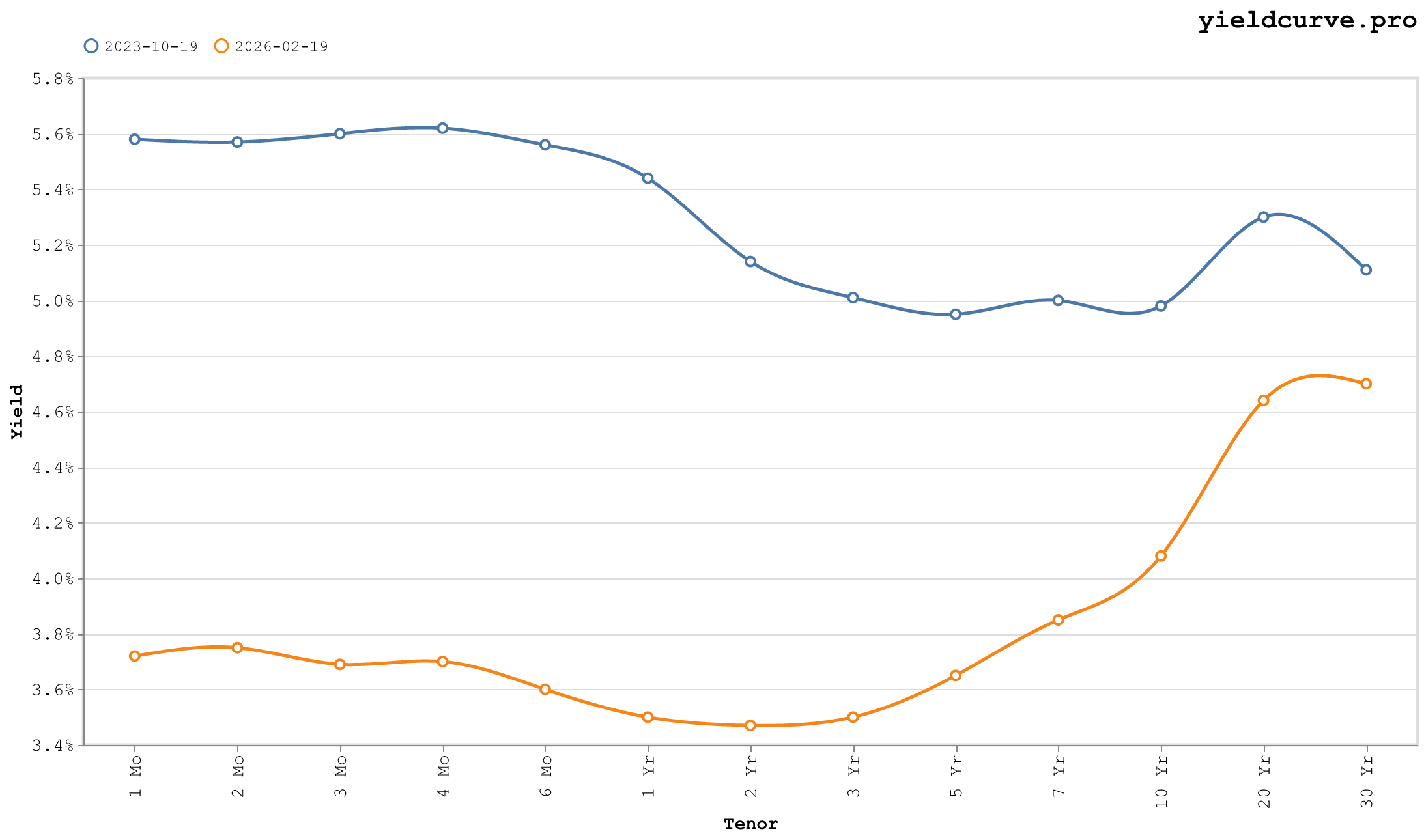
Figure 10: 10Y Touches 5% — term premium resurgence, 2s10s −16 bps, 20Y-30Y inversion at +19 bps.
The 10Y printed 4.98% — 5% for the first time since July 2007. The curve was still inverted: 2s10s at -16 bps, 10Y-3Mo at -62 bps. But the direction had reversed. This rally in long yields was not driven by short-rate repricing; it was driven by term premium.
The ACM model (Adrian, Crump, and Moench 2013) estimated term premium near zero or slightly positive at this point, recovering from deeply negative readings in 2021. The market had concluded, belatedly, that the neutral rate was higher, that the deficit path required higher concessions from bond buyers, and that the "Fed put" on long duration had a far higher strike than post-GFC investors had assumed.
The 20Y at 5.30% sat above the 30Y at 5.11% — a 19-bps inversion at the long end driven by convexity demand. Pension funds and insurance companies prefer 30Y bonds for liability matching, compressing that yield relative to the 20Y. Two inversions operating simultaneously from two distinct forces: monetary policy at the front, convexity demand at the back.
Signal at the time: The end of the inversion cycle. Term premium was returning. "Higher for longer" was being priced into duration, not just the front end.
Conclusion
What the curve records across these ten snapshots is not a collection of crises but a single continuous story: the cost of money, the shape of expectations, and the residual between the two. The 2003 steepness planted the seeds of the 2006 flatness. The 2008 zero lower bound planted the 2022 inversion. Every shape is the consequence of the last.
The curve doesn't predict. It prices.
All data via yieldcurve.pro. Term premium methodology: Adrian, Crump, and Moench (2013), NY Fed. Level/Slope/Twist factor decomposition: Litterman and Scheinkman (1991).
Back
Sign in to leave a comment.
Comments (0)